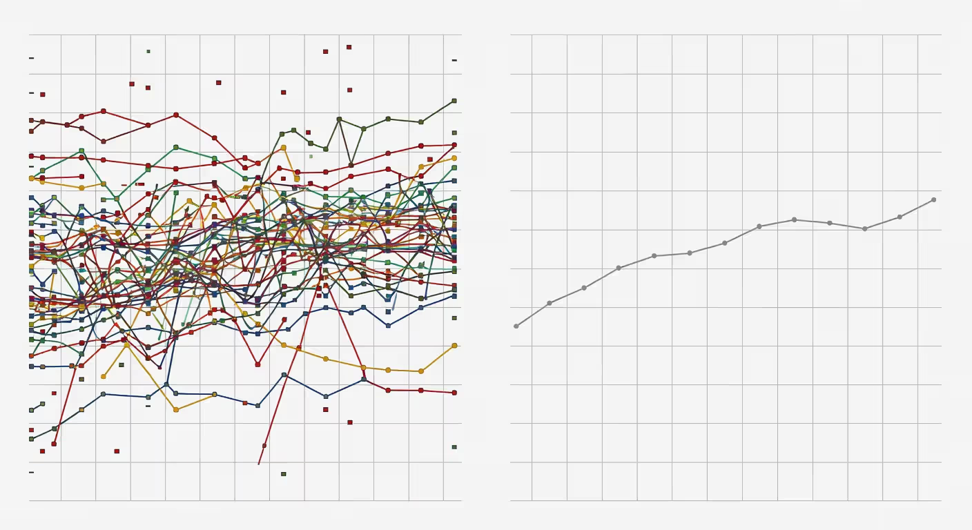
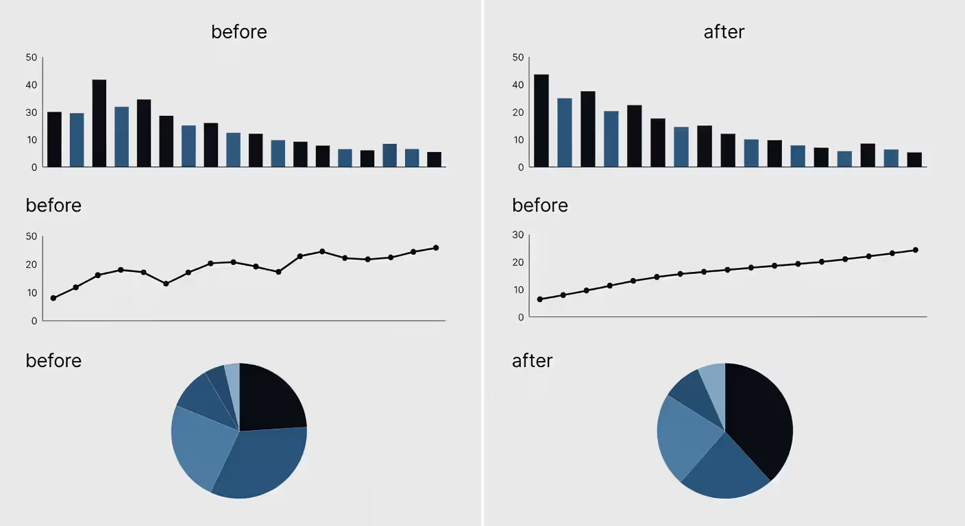
Staring at rows of numbers in a spreadsheet? Your eyes glaze over. You miss the story hiding in those cells. But turn those same numbers into a chart, and suddenly—boom—you spot the trend in three seconds flat.
Visuals cut through complexity. They reveal what matters. And they help you explain it to anyone, whether they're data-savvy or not.
What Is Data Visualization and Why It Matters
Think of data visualization as translation work. You're converting raw numbers, statistics, and measurements into pictures—bar charts, line graphs, heat maps, dashboards—that let people grasp information at a glance.
Why does this matter so much? Your brain processes images roughly 60,000 times faster than text. Show someone a line graph tracking quarterly revenue, and they'll spot the July dip before you finish your first sentence. Hand them a spreadsheet with the same numbers? They'll need five minutes just to orient themselves.
Companies use visual data displays to make faster, smarter choices. Marketing directors figure out which campaigns actually drove conversions. Supply chain managers locate the exact bottleneck slowing down shipments. CFOs track burn rate without wading through 40-page reports.
Here's where it really pays off: explaining your findings to others. Try describing the relationship between customer age groups and product preferences using paragraphs alone. You'll lose half your audience before you finish. Drop in a scatter plot, though? Everyone gets it immediately.
Good visualization bridges the gap between analysts who live in the data and executives who need to act on it. It democratizes information. When the presentation's done right, you don't need a statistics degree to understand what's happening.
Author: Damien Crowhurst;
Source: aleanetwork.net
Common Types of Data Visualization
Your data tells a specific story. The format you pick should match that story, not just look pretty.
Bar charts compare quantities across categories. Think regional sales figures or product performance side-by-side. They're simple, universally understood, and hard to mess up.
Line graphs track changes over time. Stock prices, website traffic, temperature readings—anything with a time dimension works here. The line's slope tells the story instantly.
Pie charts show parts of a whole. Market share breakdowns, budget allocations, demographic splits. But here's the catch: they only work well with three to five slices. More than that? Your audience will struggle to compare the pieces.
Scatter plots reveal relationships between two variables. They expose correlations, clusters, and outliers. Data scientists reach for these when exploring new datasets.
Heat maps use color intensity to represent values across two dimensions. Website click patterns, sales concentration by geography, hourly activity levels—anywhere you want to highlight hot spots versus cold spots.
Geographic maps anchor your data to actual locations. Election results, disease outbreaks, store locations—any information tied to places benefits from this approach.
Dashboards combine multiple chart types into a single view. They're like mission control, showing KPIs, trends, and alerts all at once. Executives practically live in dashboards.
Infographics blend data visuals with design elements and narrative flow. They prioritize storytelling over deep analysis—great for public communications and marketing content.
The biggest mistake I see? People default to whatever chart type they know best, regardless of whether it fits their data. Don't do that.
Static vs Interactive Data Visualization
Static visuals are fixed images. Charts in PowerPoint decks, graphs in printed reports, infographics shared on Instagram. They show one thing, one way. They're easy to create, easy to share, and work everywhere.
Interactive visualizations let people explore. Hover to see details. Filter by date range. Drill down into subcategories, zoom, pan, switch between views.
Interactive formats shine when you're presenting to diverse audiences with different questions. A sales dashboard might show national trends for executives while letting regional managers examine their specific territories. Same visualization, personalized insights.
The tradeoff? Interactive visuals require more sophisticated tools and hosting. You can't print them meaningfully. And if the interface is clunky, people get frustrated and give up.
Use static formats for presentations, formal reports, and social media sharing. Use interactive formats for ongoing analysis, self-service analytics, and situations where your audience needs to ask their own questions.
Most organizations need both. Static visuals for storytelling and final deliverables. Interactive versions for exploration and day-to-day monitoring.
Essential Data Visualization Techniques
Picking the right chart type is just step one. How you execute it matters just as much.
Color theory can make or break your visual. Use color deliberately. Red typically signals problems or declines. Green means positive results or growth. Blue stays neutral. Don't throw in rainbow gradients just because they look cool—they confuse rather than clarify.
Stick to three to five colors maximum. More than that, and viewers can't keep track of what each color means. Also, remember that about 8% of men have some form of color blindness—test your palette accordingly.
Layout principles guide where people look first. Put your most important information in the top-left corner where Western readers naturally start. Use size to indicate importance. Group related items together and use whitespace to separate different concepts.
Alignment matters more than you'd think. When elements are scattered randomly, it creates visual noise that pulls attention away from your message.
Data hierarchy establishes what's most important. If you're showing sales data, total revenue should dominate. Regional breakdowns come second. Individual store details can be accessed through interaction or hidden until needed.
Less is almost always more here. Every element you add requires mental processing from your viewer. Ask yourself: does this help understanding, or does it just look fancy?
Simplification strategies separate great visualizations from merely adequate ones. Remove gridlines unless they're essential for reading exact values. Cut redundant labels. Ditch 3D effects—they distort perception without adding any analytical value.
Edward Tufte calls unnecessary decoration "chartjunk." Get rid of it.
Storytelling through visuals turns data into narrative. Annotations guide interpretation: "This sales drop happened because of supply chain disruptions." Arrows emphasize important changes. Progressive reveals build anticipation and payoff.
Think about what question your audience wants answered, then design the visual to answer that question as directly as possible.
Author: Damien Crowhurst;
Source: aleanetwork.net
How AI Is Transforming Data Visualization
Artificial intelligence has changed how we create and interact with visual data. This isn't hype—the technology actually delivers.
Automated chart generation saves hours of manual work. Upload your dataset, and AI suggests appropriate visualization types based on data structure. It recognizes time-series data and recommends line graphs. It spots categorical comparisons and suggests bar charts. The guesswork disappears.
Tools like Microsoft Power BI and Tableau now include AI assistants that auto-generate entire dashboards. They're not perfect, but they give you a solid starting point in minutes instead of hours.
Natural language interfaces accept questions in plain English. Type "show me sales trends by region for the last quarter," and AI produces the right visualization. No SQL queries, no manual chart building required.
This democratizes data access. Marketing managers who don't know database languages can now explore data on their own. That's huge organizational value.
Predictive visual analytics overlay forecasts onto historical data. AI models project where things are heading and show confidence intervals visually. You see the future trajectory, not just the past.
Sales forecasting, inventory planning, capacity management—predictive visuals turn these from gut-feel exercises into data-informed processes.
Smart recommendations analyze your data and surface insights you might miss. "Northeast region showing accelerated decline compared to other territories." "Customer churn correlates strongly with support ticket volume." AI spots patterns that human analysts might overlook in large datasets.
Automated anomaly detection visually highlights outliers. Unusual spikes, unexpected drops, data points that deviate from normal patterns—AI flags these automatically and draws your attention to them.
The technology isn't replacing human judgment. It handles the repetitive stuff so analysts can focus on interpretation and strategic thinking. That's the real value of visualizing data with AI.
Choosing the Right Data Visualization Software
The market's crowded with options. Your choice depends on your needs, budget, and team's technical skills.
Tableau remains the enterprise gold standard for business intelligence. It's powerful, handles massive datasets, and creates beautiful, interactive dashboards. The learning curve is moderate—expect a few weeks to get comfortable. Pricing starts around $70 per user per month.
Best for: mid-to-large organizations with dedicated analytics teams.
Microsoft Power BI integrates tightly with Microsoft's ecosystem. If you're already using Excel, Azure, and Office 365, Power BI is a natural fit. It's slightly less intuitive than Tableau but significantly cheaper at about $10 per user per month.
Best for: Microsoft-centric organizations looking for cost-effective BI.
Google Looker Studio (formerly Data Studio) is completely free and cloud-based. It connects easily to Google Analytics, Google Ads, and BigQuery. The interface is straightforward, though advanced features lag behind Tableau or Power BI.
Best for: small businesses, marketing teams, anyone on a tight budget.
D3.js is a JavaScript library for building custom, web-based visualizations. It's incredibly flexible—you can build virtually anything. But you need to know how to code. This isn't point-and-click software; it requires programming skills.
Best for: developers and data scientists who need complete customization control.
Python libraries (Matplotlib, Seaborn, Plotly) serve the data science community. They're code-based but integrate seamlessly with analytical workflows. If your team already uses Python for data analysis, these libraries are natural extensions.
Best for: data scientists and analysts comfortable with coding.
AI-native tools like Polymer, Notably, and Vizly emphasize automated insights and natural language queries. They're newer to the market but growing fast. These platforms prioritize ease of use over deep customization.
Best for: business users who want quick insights without technical training.
Here's how the major platforms compare:
Tool
Best For
Pricing Model
AI Features
Skill Level Required
Tableau
Enterprise analytics, complex dashboards
~$70/user/month
Auto-insights, trend detection
Moderate
Power BI
Microsoft ecosystem integration
~$10/user/month
Natural language Q&A, smart narratives
Moderate
Looker Studio
Budget-conscious small teams
Free
Basic auto-recommendations
Beginner
D3.js
Custom web visualizations
Free (open source)
None built-in
Advanced
Python (Plotly)
Data science workflows
Free (open source)
Integrates with ML libraries
Advanced
Polymer
Fast automated analysis
Free tier, ~$40/month paid
Full AI-driven insights
Beginner
Don't buy more than you need. A solo marketer tracking campaign metrics doesn't need Tableau. Looker Studio will do fine. But if you're managing data for 500 users across multiple departments, free tools won't cut it.
Author: Damien Crowhurst;
Source: aleanetwork.net
Data Visualization Best Practices to Follow
Follow these guidelines to avoid common pitfalls and create more effective visuals.
Match your visual type to your data type. Time-series data needs line graphs or area charts. Categorical comparisons work with bar charts. Relationships between variables call for scatter plots. Using the wrong format confuses your audience no matter how pretty it looks.
Start your Y-axis at zero for bar charts. This trips people up constantly. When bar charts start at 50 instead of zero, tiny differences look massive. You're distorting perception, even if that wasn't your intent.
Line graphs have more flexibility here—you can zoom into a range to show detail. But bars measure magnitude, and magnitude needs zero as the reference point.
Design for your specific audience. Executives want high-level summaries with clear takeaways. Analysts want granular data they can explore. Team members want context and explanation. One-size-fits-all rarely works.
C-suite dashboards should show three to five key metrics with directional indicators. Operations dashboards might show 20 metrics with drill-down capability.
Make your visuals accessible. Use sufficient color contrast. Don't rely solely on color to convey meaning—add labels or patterns too. Provide text alternatives that screen-reading software can interpret. Make interactive elements keyboard-navigable.
About 15% of people have some form of disability. Accessible design is both ethical and practical.
Keep your data accurate. This sounds obvious, but it's easy to misrepresent things accidentally. Double-check that your axes are labeled correctly. Verify your data source is reliable. Make sure percentages add up to 100 when they should.
One wrong number can destroy trust in all your work.
Provide context. A graph showing 15% sales growth sounds great—unless the industry average was 30%. Always include benchmarks, comparisons, or historical perspective so viewers can judge whether your numbers are good, bad, or neutral.
Label clearly. Every chart needs a descriptive title. Axes need labels with units. Legends should eliminate ambiguity. If someone sees your visualization without the surrounding text, they should still understand what they're looking at.
Remove unnecessary elements. Every line, color, and shape should serve a purpose. Decorative elements distract. Heavy gridlines clutter. 3D effects distort. When in doubt, take it out.
Test your visualizations. Show them to someone who doesn't know the underlying data. Ask what they see. If they misinterpret or get confused, redesign. You know the data intimately, which makes it hard to spot where others might struggle.
Above all else show the data.
— Tufte Edward
Common Data Visualization Mistakes and How to Avoid Them
Even experienced analysts fall into these traps. Knowing about them helps you avoid them.
Misleading scales distort reality. Truncated Y-axes, inconsistent intervals, or logarithmic scales without clear labeling all manipulate perception. Sometimes this is intentional (to make results look better), but often it's just carelessness.
Fix it: Always start bar charts at zero. Label scales clearly. If you're using non-standard scaling, call it out prominently.
Overcomplicated designs hide insights under visual clutter. I've seen dashboards with 15 different chart types, rainbow color schemes, and so much data packed in that you can't focus on anything.
Fix it: Simplify ruthlessly. One clear insight beats five muddled ones. If your visualization needs a 10-minute explanation, redesign it.
Poor color choices make data hard to read. Insufficient contrast between colors, too many similar shades, or color combinations that don't work for colorblind viewers all create problems.
Fix it: Use established color palettes designed specifically for data visualization. Tools like ColorBrewer provide tested combinations. Limit yourself to three to five colors per visual.
Ignoring context leaves viewers without the information they need to interpret correctly. A spike in website traffic looks impressive until you remember you ran a major ad campaign that week.
Fix it: Add annotations for significant events. Include comparison periods. Provide benchmarks or targets so viewers know what "good" looks like.
Wrong chart types happen more often than you'd think. Pie charts with 12 slices. Line graphs for non-sequential categories. 3D charts that make it impossible to compare values accurately.
Fix it: Match format to data type. When in doubt, default to simple bar charts or line graphs—they're hard to screw up.
Too much data at once overwhelms viewers. A table with 50 rows and 12 columns isn't a visualization; it's just a data dump with graphics around it.
Fix it: Aggregate, filter, or provide drill-down capability. Show summaries first, with details available on request.
Inconsistent formatting across dashboards or reports creates confusion. One chart uses blue for Category A, another uses red for the same category. Date formats vary between visuals.
Fix it: Create and follow a style guide. Colors, fonts, formats, and layouts should stay consistent throughout.
The most common mistake of all? Creating visualizations for yourself instead of your audience. You know the data intimately. They don't. Design from their perspective, not yours.
Author: Damien Crowhurst;
Source: aleanetwork.net
FAQ: Data Visualization Questions Answered
What is the easiest data visualization tool for beginners?
Google Looker Studio offers the smoothest entry point for newcomers. It's completely free, runs in your browser, and connects easily to familiar data sources like Google Sheets and Analytics. The drag-and-drop interface feels intuitive—you can build a working dashboard in your first hour. Microsoft Excel deserves mention too, since most professionals already know it and its charting features handle basic visualization needs well. For those wanting AI guidance from day one, platforms like Polymer provide automated insights that show you what good visualizations look like while you're building them.
How does AI improve data visualization?
AI enhances data visualization in several concrete ways. It automates format selection by analyzing your data structure and suggesting appropriate chart types—saving you from choosing the wrong format. Natural language interfaces let you ask questions in everyday language and get instant visual answers without writing queries or building charts manually. AI also spots patterns and anomalies you might miss, automatically highlighting unusual trends or outliers. Predictive analytics overlay future projections onto your historical data, showing where things are heading. The main benefit is speed—tasks that took hours now take minutes, letting you focus on interpretation instead of construction.
What type of chart should I use for time-series data?
Line graphs are your default choice for time-series information. They show trends clearly and make it easy to spot patterns, cycles, and changes in direction. The continuous line emphasizes the flow of time and helps viewers sense momentum. Area charts work well when you want to emphasize magnitude or show cumulative totals over time. Bar charts can work for time series when you have discrete time periods (like monthly or yearly data) and want to emphasize comparisons between individual periods over trend. Avoid pie charts for time-series data entirely—they don't show temporal relationships at all. When comparing multiple time series, use multiple lines on one graph (limit to three or four lines to avoid clutter) or create small multiples showing each series in its own panel.
Can data visualization be misleading?
Absolutely. Data visualization can mislead through truncated axes that exaggerate small differences, inconsistent scales that make invalid comparisons possible, cherry-picked date ranges that hide unfavorable periods, or inappropriate chart types that distort perception. Sometimes this is intentional manipulation, but often it's just poor design choices. Three-dimensional pie charts are notorious for distorting proportions through perspective effects. Dual-axis charts can suggest correlations that don't exist by scaling the axes differently. Even color choices can bias interpretation—using red for one product and green for a competitor subtly implies which one is "good." The solution is healthy skepticism. Always check the axes, scales, and data sources. Ask what's been left out. Consider whether the visual format matches the data type. Good visualization clarifies; bad visualization obscures.
Do I need coding skills to create data visualizations?
Not for most business applications. Tools like Tableau, Power BI, and Looker Studio work entirely through point-and-click interfaces. You can build sophisticated dashboards without writing a single line of code. Excel and Google Sheets also offer decent charting capabilities with no programming required. However, coding skills unlock additional possibilities. If you want fully customized visualizations, web-based interactivity, or integration with data science workflows, you'll need JavaScript (for D3.js) or Python (for Matplotlib, Seaborn, Plotly). The good news is that the learning curve for basic Python visualization is gentle—you can create useful charts with just a few hours of study. Most professionals land somewhere in the middle: they use no-code tools for 90% of their work and occasionally bring in developers for custom needs.
What industries benefit most from data visualization?
Every industry benefits, but some see particularly dramatic impacts. Healthcare uses visualizations to track patient outcomes, disease progression, and operational efficiency—literally saving lives through better pattern recognition. Finance relies on visual data for market analysis, risk assessment, and fraud detection. Retail and e-commerce visualize customer behavior, inventory levels, and sales patterns to optimize everything from pricing to warehouse locations. Manufacturing uses visual dashboards to monitor production lines, quality metrics, and supply chains in real time. Marketing and advertising teams practically live in visualization tools, tracking campaign performance, customer journeys, and ROI across channels. Government and public policy use visualizations to communicate complex information to citizens and make data-informed decisions. Honestly, if your work involves making decisions based on information—and whose doesn't in 2025—you benefit from visualization.
Moving from raw numbers to visual understanding isn't optional anymore. It's how modern organizations operate. Whether you're starting with basic Excel charts or building AI-powered dashboards, the goal stays the same: make data clear, actionable, and accessible to everyone who needs it. Start simple, follow proven practices, and keep your audience's needs front and center. The tools will keep evolving, but the principles of effective communication stay constant.
An AI data analyst uses machine learning to automate data analysis tasks—pattern recognition, anomaly detection, and insight generation—that traditionally required hours of manual work. Learn how these tools differ from human analysts, the core technologies behind them, and which platforms fit your needs.
An AI writing assistant uses natural language processing and machine learning to help you draft, edit, and polish content. Discover how these tools work, what they can create, their accuracy limitations, and how to choose the right AI writing software for your needs.
AI infrastructure includes the compute hardware, storage, networking, and orchestration that power machine learning systems. This guide covers core components, hardware requirements for training vs inference, cloud versus on-premises trade-offs, and practical planning strategies for organizations building AI capabilities.
A knowledge base is your organization's single source of truth for documentation, FAQs, and processes. This guide covers what knowledge bases are, how they work, AI-powered features, setup steps, tool comparisons, and best practices for building one that drives adoption.
The content on this website is provided for general informational and educational purposes only. It is intended to explain concepts related to AI tools, agents, developer infrastructure, coding assistants, APIs, and productivity workflows.
All information on this website, including articles, guides, and examples, is presented for general educational purposes. Outcomes and tool performance may vary depending on implementation, skill level, and use case.
This website does not provide professional AI consulting, development services, or guarantees of results, and the information presented should not be used as a substitute for consultation with qualified AI or software development professionals.
The website and its authors are not responsible for any errors or omissions, or for any outcomes resulting from decisions made based on the information provided on this website.